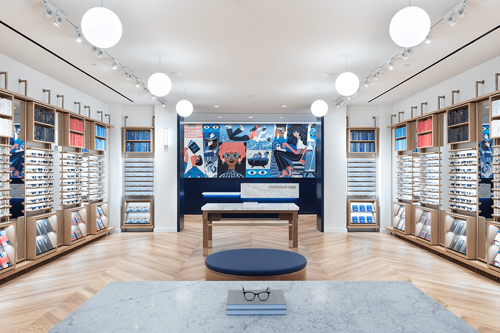
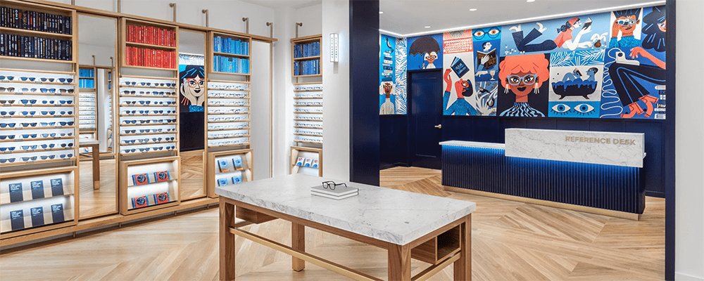
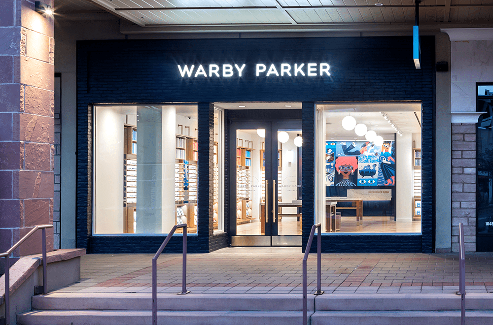
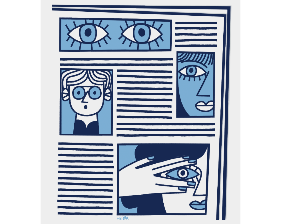
I had a great pleasure to design and draw a custom wallpaper and prints for Warby Parker’s store – Twenty Ninth Street, Boulder, Colorado.
Art direction: Matt Singer
Interior photos courtesy of Warby Parker.
The client:
Warby Parker is an American retailer of prescription glasses and sunglasses. The company was founded in 2010 with a lofty objective: to offer designer eyewear at a revolutionary price while leading the way for socially conscious businesses. Since 2010, Warby Parker opened 55 stores across the U.S. and Canada.
The project:
Warby Parker often works with artists to create original artwork for the interior of every location. Their distinctive visual language includes figurative and abstract works that celebrate the love of art, literature, design, and glasses.
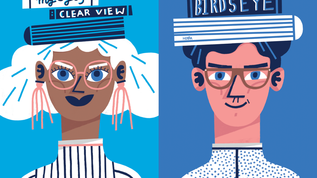
I was asked to design and draw a custom wallpaper and two stand-alone pieces for Warby Parker’s new store in Boulder Colorado.
The brief: The Client wanted the artwork to possess a clean and witty sense of design, be timeless and reflect the brand’s essence. The look and feel had to be contemporary with references to literature, art, music, or film. We agreed it would be fun to include some details that nod to the area – Boulder Colorado has lots to consider (nature, land, tourism). The tone was supposed to be intelligent, witty, sincere, playful, and delightful. Elements the Client wanted to see were: books, eyeglasses, people wearing glasses, people reading, people writing.
The work:
I designed a pattern divided into geometrical areas, each presenting a different story. Some of the stories refer to Warby Parker’s usual themes like glasses, reading, books, writing. Some of them refer to local motives: skiing, mountains, music, nature. All designs of the spectacles in the illustration are based on models available in WP’s shop. The colour palette is based on the corporate colours of Warby Parker with additional tones selected by me.

